In this update
- Brand positioned around curiosity, clarity, and social replay.
- Review flow chosen over a plain brochure-style layout.
- Email and Instagram routes anchored from day one.
The earliest planning pass for BuyMeARock.com focused on the name first. It is simple, emotional, and funny in a way that most jewelry domains are not. Instead of sounding like a catalog or a lab report, it sounds like something a person would actually say in a text message, which makes it naturally stronger for social sharing, creator campaigns, and high-click ad copy.
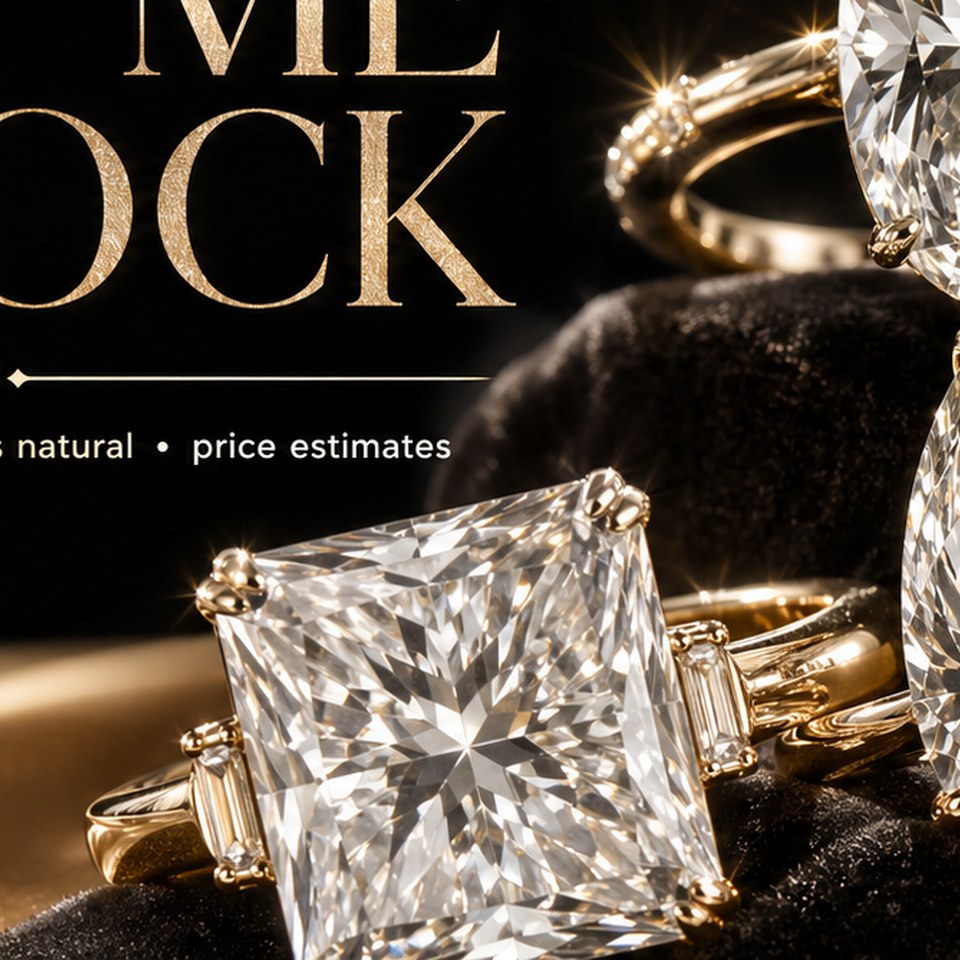
That naming strength pushed the site in a very specific direction: not just a landing page, but a living diamond brand with a clear utility layer. The update emphasized luxury visuals, diamond education, and a clean path for someone to ask for help understanding a stone before they spend real money.
This positioning decision also set the tone for every later update. Rather than pretending to be a licensed grading lab, the site would act like a memorable discovery layer: upload a certificate, compare lab and natural price bands, and then move interested shoppers toward follow-up or direct inquiry.